Gallery North Website
I designed and developed the website for Gallery North, a long-standing artist cooperative gallery located in downtown Edmonds. The project focused on modernizing the gallery’s digital presence while preserving the warmth, accessibility, and community-centered identity that has defined the organization for more than sixty years. The redesign emphasized a clean, editorial-inspired visual system intended to […]
Global Credit Union
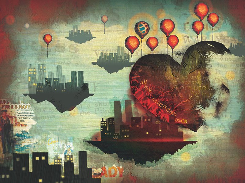
Through their 2013 rebrand, Global Credit Union embraced their history while looking to the future with a resurgence of their message “Global is Everybody’s Credit Union,” encouraging people to become “Global Citizens” by saving money and giving back to the community. The introduction of the Global Citizen theme and Global Citizen Principles highlighted the credit union’s active support of select charitable causes, local artists, small businesses and organizations. The campaign featured TV and radio commercials with original compositions by local musicians and original artwork in print, billboard, bus and vehicle wraps by local artists. This particular work was done for the Global Citizen Campaign with a focus on their Wear Red days, in honor of military veterans.
Filene i3 – Augmented Reality

Filene i3 is a two-year innovation leadership program equipping top credit union professionals with the mindset, tools, and network to lead and shape the future.
Through this cohort-based program, participants work in cross-functional teams to explore and address some of credit unions’ most pressing challenges as identified by Filene’s Think Tank and backed by research from Filene’s Centers of Excellence.
< br>i3 participants learn cutting-edge innovation competencies grounded in three core categories:
Facilitating Innovation: Engaging the diverse perspectives of members, staff, stakeholders, and subject-matter experts to co-create new solutions.
Accelerating Learning: Exploring and iterating new ideas to gain insight, reduce risk, and validate solutions.
Leading Change: Mobilizing people and resources to inspire action and make change happen
Power In Together

Salal CU teamed up with media company Digital Brew to produce an animated short video that captured the heart of Salal’s brand message. The video itself was placed as a paid ad on YouTube, while silent shorts were versioned our for Facebook and Instagram, leading traffic to both Salal CU’s home page as well as a custom splash page tailored to new members.
Deposit Promotion Hub Landing Page
Scenario: We were tasked with launching four simultaneous deposit promotions at once. Best practice would normally call for a single product/call to action per landing page, and separate customer journeys for each product, in order to create a clear user journey for the customer. However, in this instance, we explored an alternate route to end-goal conversion rather than bottom-of-the-funnel communication methods we’ve used in the past.
Tasks: Develop a journey focused on the end user meeting their savings goals, with interactive engagements throughout their journey that would end in product recommendations based off of their needs.
Actions:
– Define use cases for each product we were promoting, connected to common user needs we’ve encountered in the past, corroborated with present member feedback.
– Use SEO keyword research to better understand what questions end users were trying to answer when looking online.
– Develop a template for each use case that would allow each product to fit within the same interactive experience, meeting SEO keyword and member feedback needs.
– Design a site that use javascript and css to create a rudimentary level of interactivity focused on the users input and subsequent needs.
– Design ways to hide information and reveal as needed based on the users actions to prevent cognitive overload.
– Develop interactive calculators to give end-users an idea of their savings based on their chosen product type.
Results:
20% Conversion rate across all iterations of the website over a 3 month time period (April to June 2023)
Increased scroll depth and click mapping compared to past promotional websites
Increase in new money deposited from traditional banking sources over a 3 month time period (April to June 2023)
Miscellaneous Logo Design
An example of the freelance brand and development work I participated in as a self-employed graphic designer.
Cannabis Member Testimonials

The primary objective of this campaign was to spotlight our Cannabis industry credit union members, their struggles, the obstacles that they face every day, and to give a platform for their stories. We wanted to increase not only awareness of what our cannabis industry members face on a daily basis, but increase awareness that our credit union is willing to bank this under-served and underbanked demographic when many other FI’s can’t or won’t.
Icon Library

These icons became the foundation of Salal CU’s icon illustration library. Beyond simply illustrating the assets, I developed guidelines for usage and creation of future assets, ensuring that any new icons created in future iterations would seamlessly integrate with the system.
Credit Card Designs

Salal Credit Union underwent a refresh of their brand, and part of this refresh was to update the visual aesthetic and align it to new brand values. Our card designs are one of the few tangible elements that members can see, hold, and use everyday when accessing our products. Having these cards be a proper representation of brand voice is a key factor in our brand strategy. Our cards needed to reflect that voice; that we’re human, inspiring, adventurous, and smart.
Case Study – Persona Research and Development
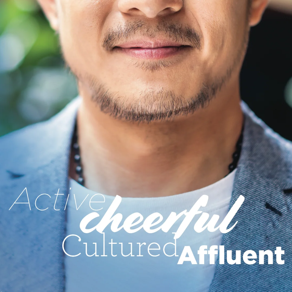
Scenario: The need for this study was to develop broad, psychographic personas that represented the four foundational member segments of Salal Credit Union’s customer base. Most of what the business lines knew about their customers was anecdotal at best, and their own personal assumptions at worst.
Tasks: Qualitative (anecdotal stories and member feedback from NPS surveys) as well as quantitative (Experian purchased data and primary owned) data were used to answer the main questions Salal had about its members.
– What were they like, demographically?
– What were the main drivers for their decision making?
– How did they specifically view sustainable business practices?
– How did they use technology?
– How should we position our messaging and sales guides when communicating with them?
Actions:
These personas were developed from the subsequent user research, and used to guide business decision making and strategy pivots. They were also released for access to every employee in the organization, not only to challenge current assumptions about our members (which were that all of our members were in their 60’s, white, and working in healthcare), but to give employees a tangible face on the idea of “our members” in order to improve member interactions. Finally, these personas were used by my design team and the marketing team at large to personalize creative, customize product and web experiences, and inform recommendations made to business lines on how to improve existing processes to meet member needs.
Results:
New personas were launched to employees in early 2020, as well as guidelines for usage. In the resulting timeframe:
NPS relationship score increased 7 points over two years (2020-2022).
NPS Detractor (indicative of dissatisfaction) percentage consistently dropped 3% over 2 years. (2020-2022)
Average positive sentiment increased 20% in 2022
Market share for classically hard to reach/disengaged 1-product customers (represented by 2 out of 4 personas) increased 5% in 2022, due to targeted messaging and deeper understanding of customer needs.