Global Credit Union
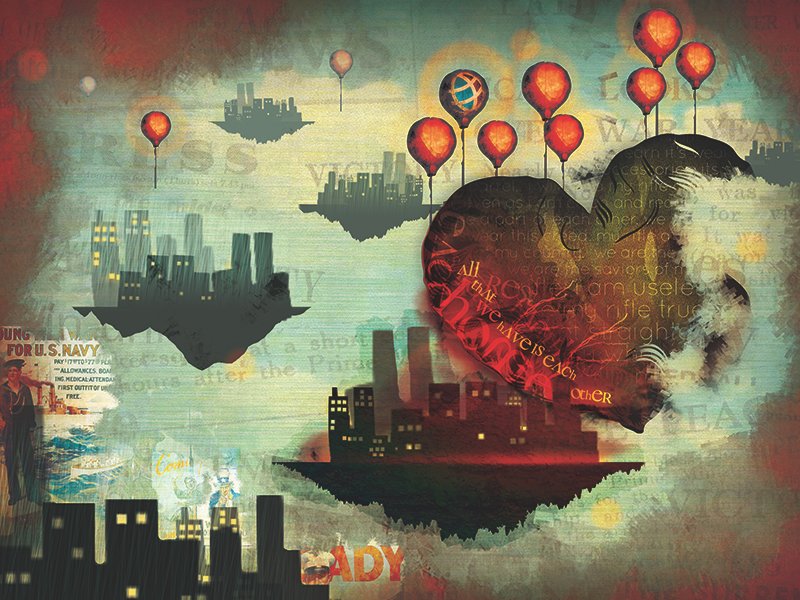
Through their 2013 rebrand, Global Credit Union embraced their history while looking to the future with a resurgence of their message “Global is Everybody’s Credit Union,” encouraging people to become “Global Citizens” by saving money and giving back to the community. The introduction of the Global Citizen theme and Global Citizen Principles highlighted the credit union’s active support of select charitable causes, local artists, small businesses and organizations. The campaign featured TV and radio commercials with original compositions by local musicians and original artwork in print, billboard, bus and vehicle wraps by local artists. This particular work was done for the Global Citizen Campaign with a focus on their Wear Red days, in honor of military veterans.
Power In Together

Salal CU teamed up with media company Digital Brew to produce an animated short video that captured the heart of Salal’s brand message. The video itself was placed as a paid ad on YouTube, while silent shorts were versioned our for Facebook and Instagram, leading traffic to both Salal CU’s home page as well as a custom splash page tailored to new members.
Miscellaneous Logo Design
An example of the freelance brand and development work I participated in as a self-employed graphic designer.
Icon Library

These icons became the foundation of Salal CU’s icon illustration library. Beyond simply illustrating the assets, I developed guidelines for usage and creation of future assets, ensuring that any new icons created in future iterations would seamlessly integrate with the system.
Credit Card Designs

Salal Credit Union underwent a refresh of their brand, and part of this refresh was to update the visual aesthetic and align it to new brand values. Our card designs are one of the few tangible elements that members can see, hold, and use everyday when accessing our products. Having these cards be a proper representation of brand voice is a key factor in our brand strategy. Our cards needed to reflect that voice; that we’re human, inspiring, adventurous, and smart.
Value Content Campaign

In the spring of 2023, multiple for-profit banks collapsed due to unstable market conditions and questionable investing practices. I chose to spearhead and run a social-focused awareness campaign dedicated to educating on the difference between CU’s and Banks, and why credit unions were more stable, reliable financial partners for everyone.
Presentation Art
Quick-turn on brand illustrations for a high priority presentation to the entire organization (300+ employees.)
B2B Pitch Deck Design
A B2B Pitch Deck developed for a business partner. This project is a great example of how Salal’s brand was built to be flexible to address both B2C and B2B use cases. It’s also a great example of how a B2B branded approach can still feel warm, authentic, human, and approachable.
Branding – Salal Credit Union

Salal Credit Union’s history as Group Health Credit Union, and a previous re-brand in 2014, had set Salal up as strategically serving healthcare professionals throughout the Pacific Northwest. However, with the legalization of cannabis in Washington state, and the opportunity to begin financing solar panel installations and home improvements for homeowners, Salal saw itself moving in very different strategic directions than the organization previously planned for. Because of these quick shifts in who Salal was serving, the brand needed a strategic makeover in order to be used effectively.
The process began with a brand audit, focused on discovery around the ways the existing brand succeeded, and where it was no longer relevant. Using board member, credit union member, and employee feedback and input, I led our internal team through the process of iterating and building out brand pillars: Archetype, Values, Mission, Vision, Purpose, and Positioning. Once established, the voice and visual systems followed.
Finally, our team custom shot and animated training videos that helped bring our new brand identity to life, and developed an internal training website that took employees through interactive modules dedicated to each brand pillar. Employees were introduced to each module via an email drip campaign that opened a new module each week, offering bite sized opportunities for our employees to learn a lot of information over a slightly longer period of time.
Web Design – Salal Credit Union

Salal CU’s existing website was 8 years old, which justified not only a re-design, but also a total overhaul of how information, UI, the UX, and design supported organizational strategy.
We approached re-mapping the site first around a topic cluster concept, in that each business line and meaningful cluster of information was structured as a content pillar. The goal was to strengthen cross-link relationships in order to increase site performance while also making it easier for a user to find and act on what they needed. The site’s primary focus was conversions and sales, with secondary goals of informing existing consumers and brand storytelling.