Deposit Promotion Hub Landing Page
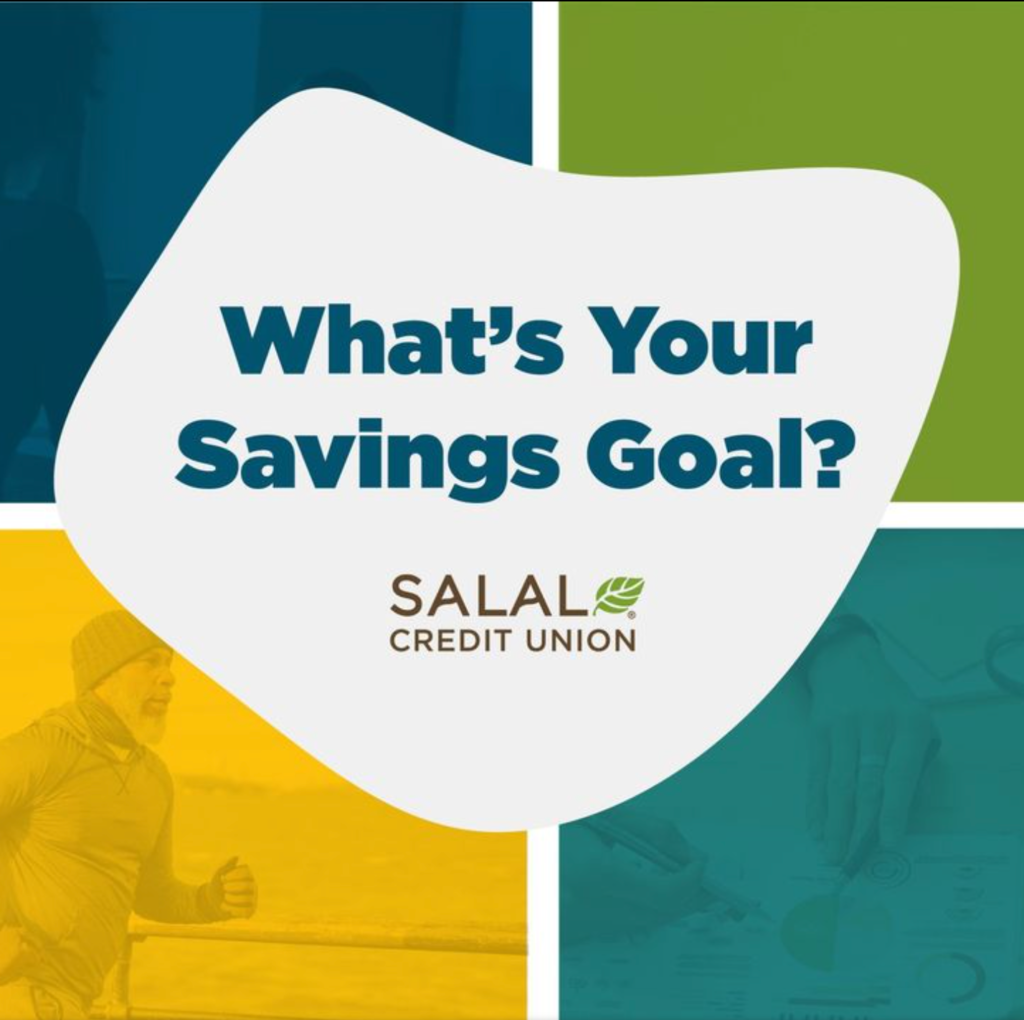
Scenario: We were tasked with launching four simultaneous deposit promotions at once. Best practice would normally call for a single product/call to action per landing page, and separate customer journeys for each product, in order to create a clear user journey for the customer. However, in this instance, we explored an alternate route to end-goal conversion rather than bottom-of-the-funnel communication methods we’ve used in the past.
Tasks: Develop a journey focused on the end user meeting their savings goals, with interactive engagements throughout their journey that would end in product recommendations based off of their needs.
Actions:
– Define use cases for each product we were promoting, connected to common user needs we’ve encountered in the past, corroborated with present member feedback.
– Use SEO keyword research to better understand what questions end users were trying to answer when looking online.
– Develop a template for each use case that would allow each product to fit within the same interactive experience, meeting SEO keyword and member feedback needs.
– Design a site that use javascript and css to create a rudimentary level of interactivity focused on the users input and subsequent needs.
– Design ways to hide information and reveal as needed based on the users actions to prevent cognitive overload.
– Develop interactive calculators to give end-users an idea of their savings based on their chosen product type.
Results:
20% Conversion rate across all iterations of the website over a 3 month time period (April to June 2023)
Increased scroll depth and click mapping compared to past promotional websites
Increase in new money deposited from traditional banking sources over a 3 month time period (April to June 2023)
Miscellaneous Logo Design
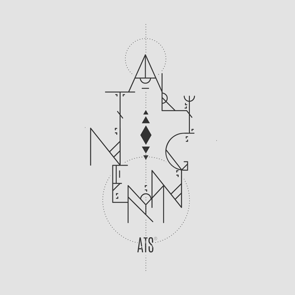
An example of the freelance brand and development work I participated in as a self-employed graphic designer.
Cannabis Member Testimonials

The primary objective of this campaign was to spotlight our Cannabis industry credit union members, their struggles, the obstacles that they face every day, and to give a platform for their stories. We wanted to increase not only awareness of what our cannabis industry members face on a daily basis, but increase awareness that our credit union is willing to bank this under-served and underbanked demographic when many other FI’s can’t or won’t.
Icon Library

These icons became the foundation of Salal CU’s icon illustration library. Beyond simply illustrating the assets, I developed guidelines for usage and creation of future assets, ensuring that any new icons created in future iterations would seamlessly integrate with the system.
Value Content Campaign

In the spring of 2023, multiple for-profit banks collapsed due to unstable market conditions and questionable investing practices. I chose to spearhead and run a social-focused awareness campaign dedicated to educating on the difference between CU’s and Banks, and why credit unions were more stable, reliable financial partners for everyone.
Presentation Art
Quick-turn on brand illustrations for a high priority presentation to the entire organization (300+ employees.)
B2B Pitch Deck Design
A B2B Pitch Deck developed for a business partner. This project is a great example of how Salal’s brand was built to be flexible to address both B2C and B2B use cases. It’s also a great example of how a B2B branded approach can still feel warm, authentic, human, and approachable.
Branding – Salal Credit Union

Salal Credit Union’s history as Group Health Credit Union, and a previous re-brand in 2014, had set Salal up as strategically serving healthcare professionals throughout the Pacific Northwest. However, with the legalization of cannabis in Washington state, and the opportunity to begin financing solar panel installations and home improvements for homeowners, Salal saw itself moving in very different strategic directions than the organization previously planned for. Because of these quick shifts in who Salal was serving, the brand needed a strategic makeover in order to be used effectively.
The process began with a brand audit, focused on discovery around the ways the existing brand succeeded, and where it was no longer relevant. Using board member, credit union member, and employee feedback and input, I led our internal team through the process of iterating and building out brand pillars: Archetype, Values, Mission, Vision, Purpose, and Positioning. Once established, the voice and visual systems followed.
Finally, our team custom shot and animated training videos that helped bring our new brand identity to life, and developed an internal training website that took employees through interactive modules dedicated to each brand pillar. Employees were introduced to each module via an email drip campaign that opened a new module each week, offering bite sized opportunities for our employees to learn a lot of information over a slightly longer period of time.
Web Design – Salal Credit Union

Salal CU’s existing website was 8 years old, which justified not only a re-design, but also a total overhaul of how information, UI, the UX, and design supported organizational strategy.
We approached re-mapping the site first around a topic cluster concept, in that each business line and meaningful cluster of information was structured as a content pillar. The goal was to strengthen cross-link relationships in order to increase site performance while also making it easier for a user to find and act on what they needed. The site’s primary focus was conversions and sales, with secondary goals of informing existing consumers and brand storytelling.
Filene i3 – CU Fintech Connect

Filene i3 is a two-year innovation leadership program equipping top credit union professionals with the mindset, tools, and network to lead and shape the future.
CU Fintech Connect Prototype
CU Fintech Connect, an advanced platform facilitating seamless collaboration between
fintech innovators and credit unions, fostering mutually beneficial partnerships. This cutting-edge
system adeptly matches credit unions with bespoke fintech solutions tailored to their distinct needs,
effectively navigating the complexities of the technological landscape. Addressing concerns related to
integration, the platform categorizes fintech offerings based on the unique technological requirements
of credit unions. It prioritizes smooth integration by offering detailed compatibility insights derived
from current user reviews. Designed with user-friendliness in mind, the interface supports resourceconstrained credit unions, streamlining the due diligence process. Customization options ensure
adaptability to the unique requirements of credit unions, promoting long-term viability. With a central
focus on elevating the member experience, CU Fintech Connect emerges as a crucial facilitator,
driving synergies between credit unions and fintechs and propelling the financial industry towards
heightened innovation and efficiency.
This concept was sold and is being developed into Finnect.